Product Overview
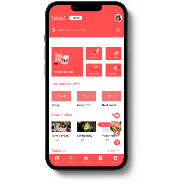
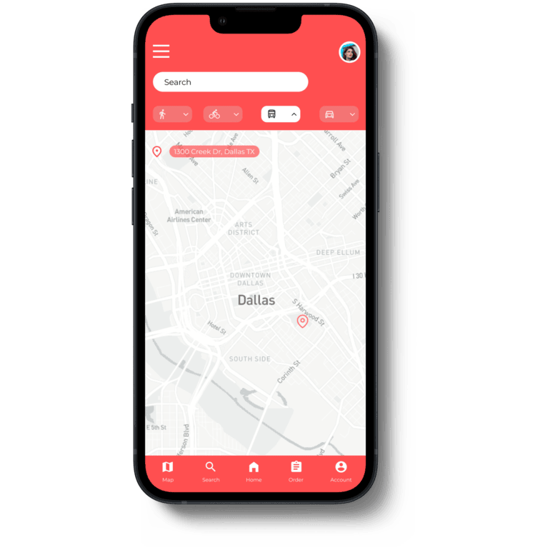
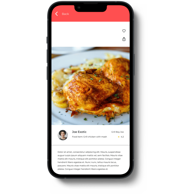
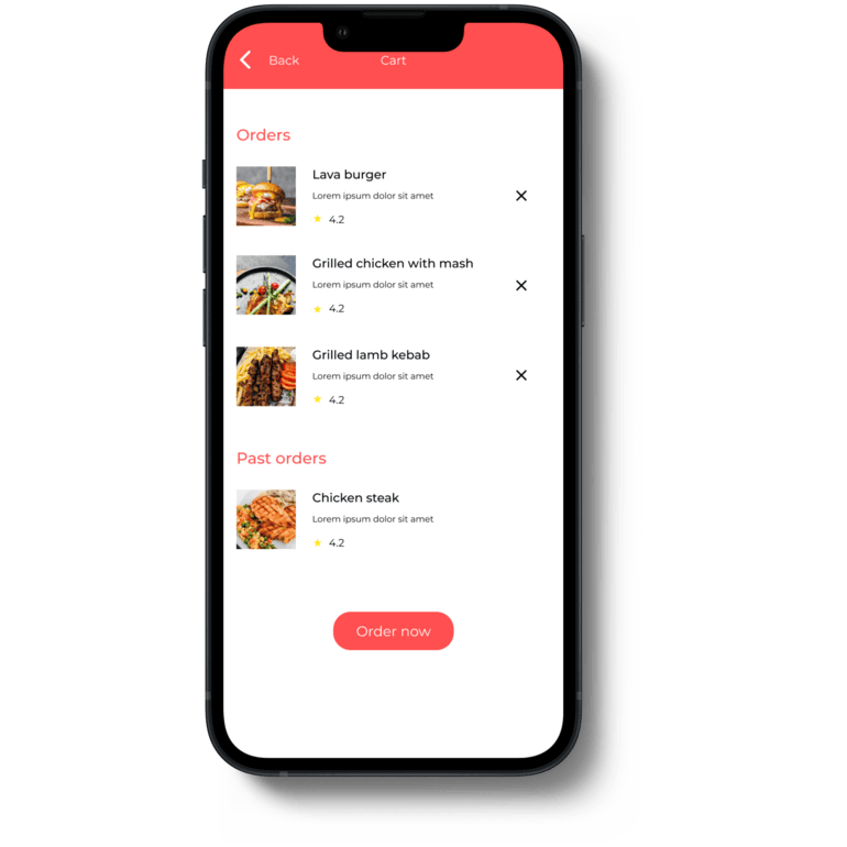
I designed a restaurant menu and payment app to simplify food discovery, ordering, and checkout. With an intuitive layout, smart search, and categorized menus, users can quickly find and customize their meals. Secure payment options, real-time tracking, and personalized recommendations ensure a seamless experience—all in just a few taps.
My Role: User Experience Research, Visual & Interaction Designer
Responsibilities: User Research, Wireframing, Mockup, and Prototyping
Softwares & Tools Figma, Illustrator, Photoshop
Project Duration: January 2022 - June 2022
Painpoints and Challenges
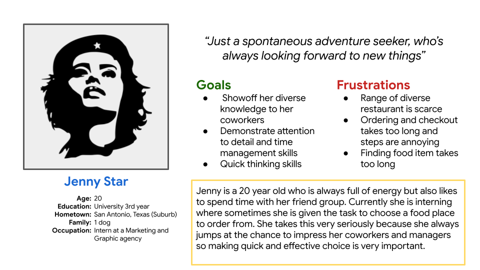
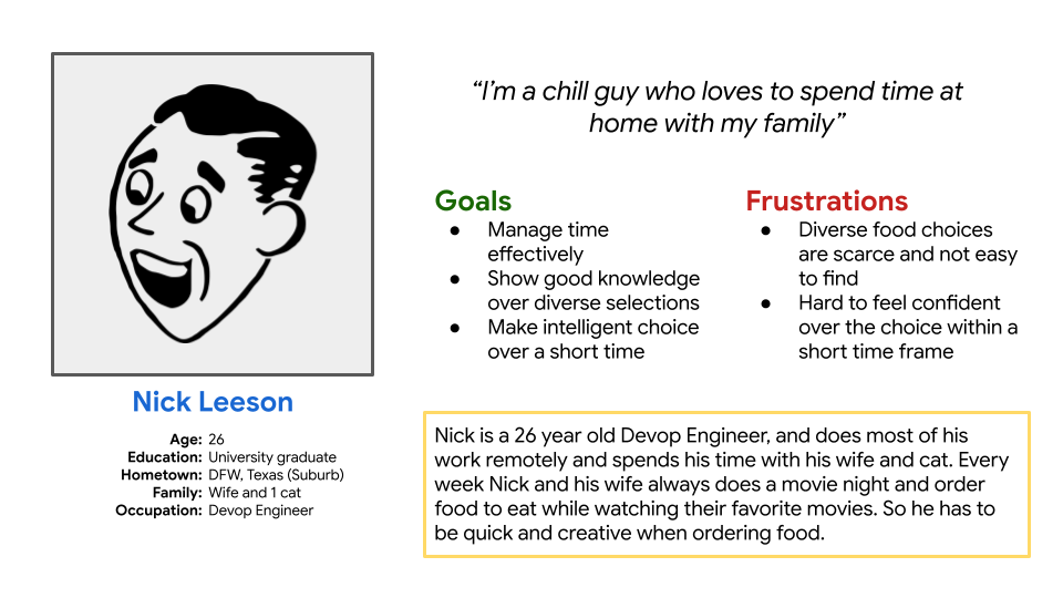
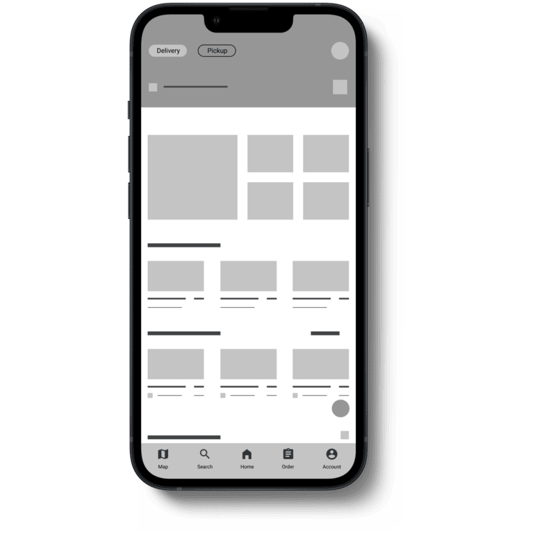
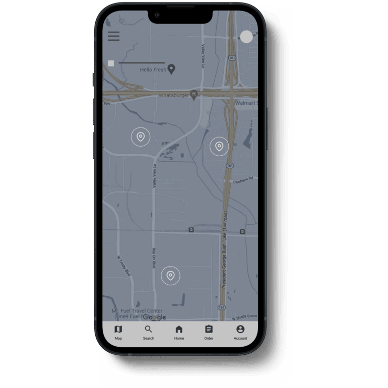
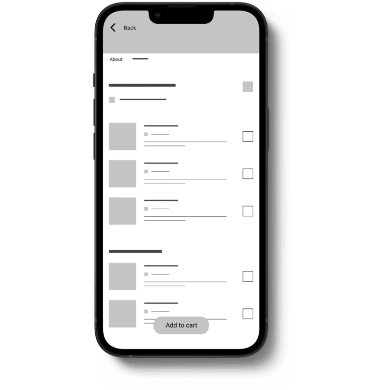
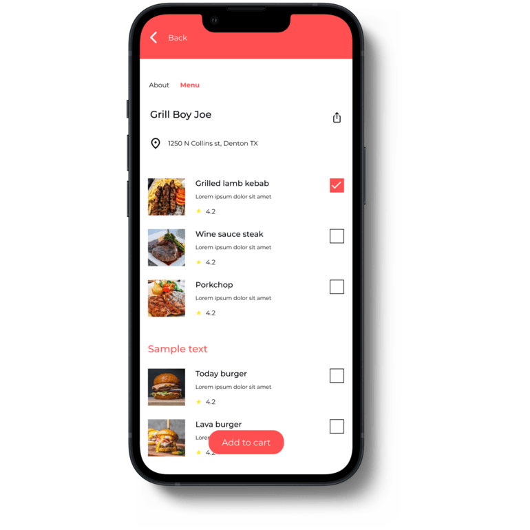
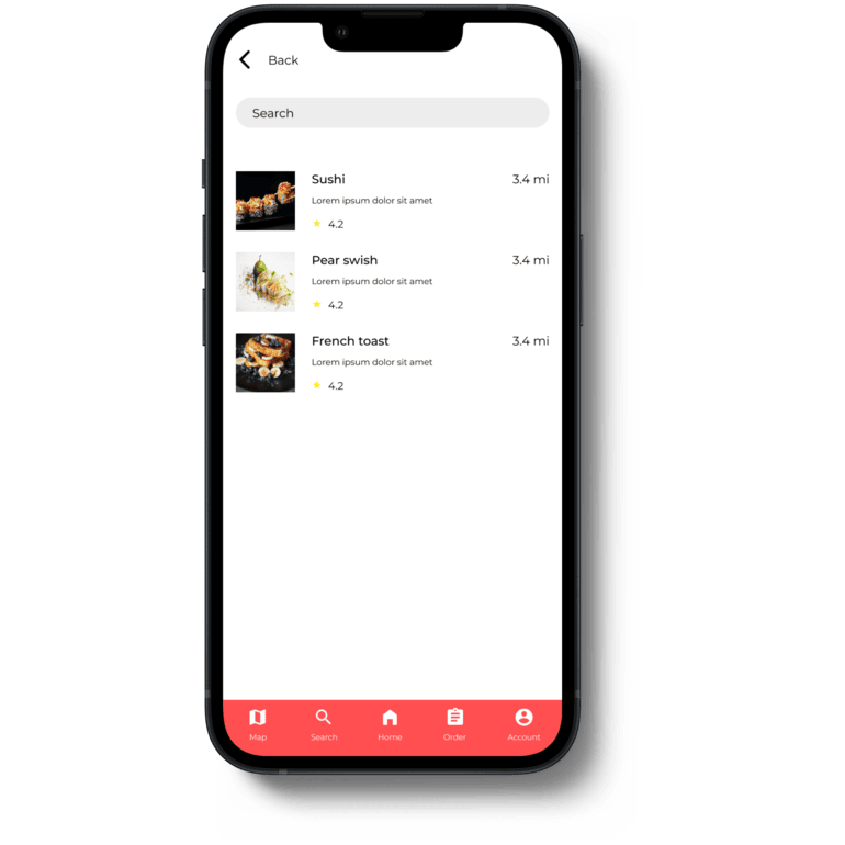
- From the interviews many users have hard time finding diverse items.
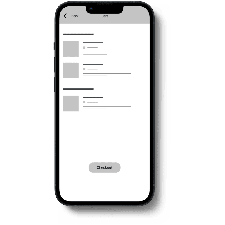
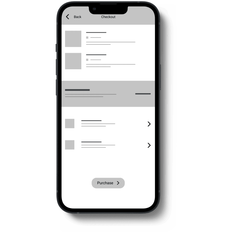
- Users hate long checkouts especially when they are asked multiple questions.
- Many people get tired of eating the same food all the time.
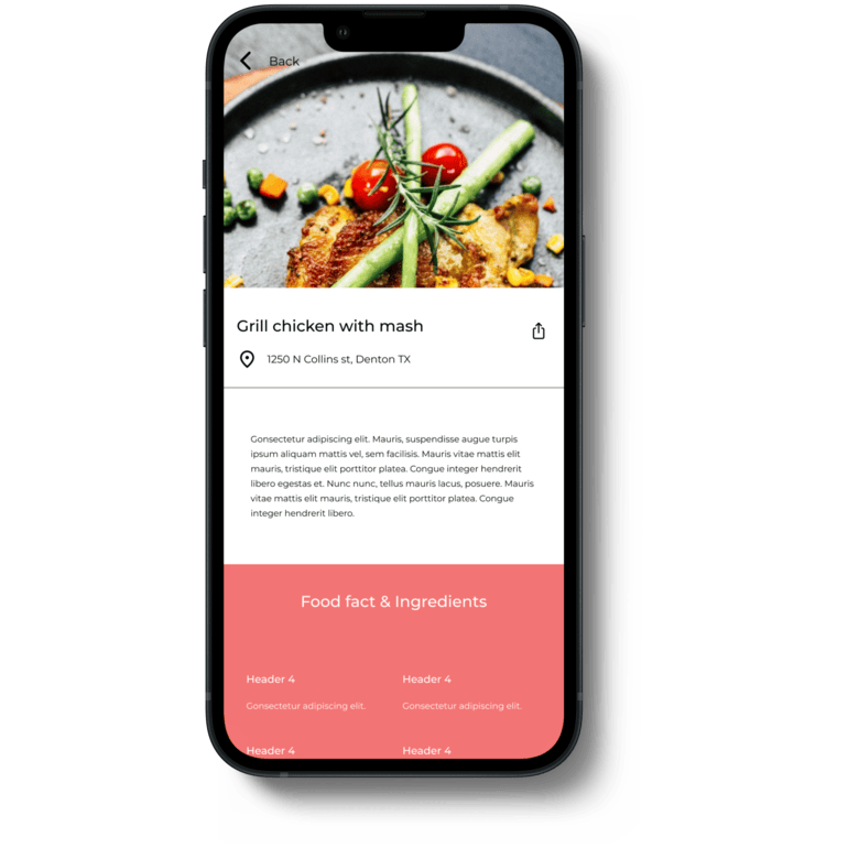
- When users make orders they always have doubts.
Inital Solutions
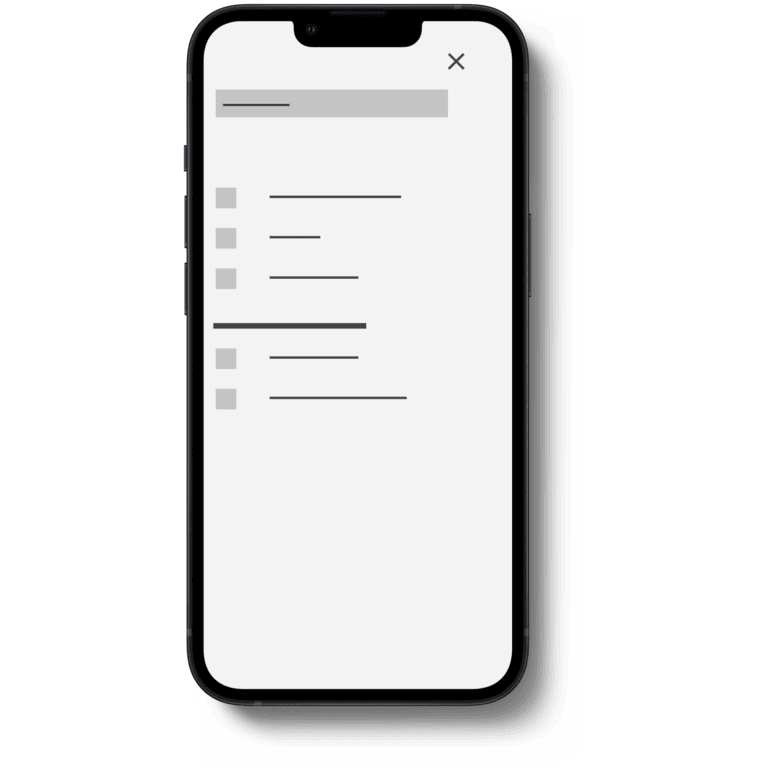
- I believe that going forward the design need to integrate a theme selector to fix this pain point.
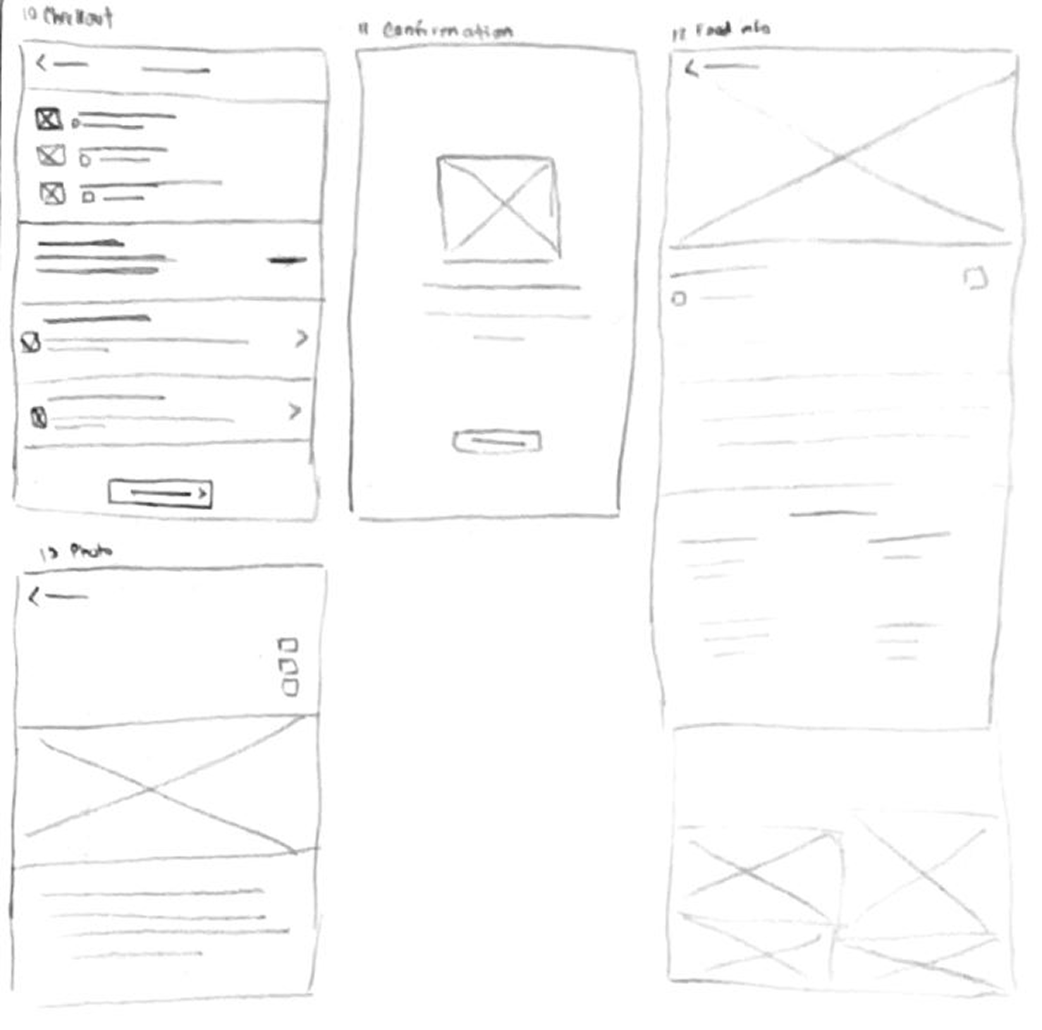
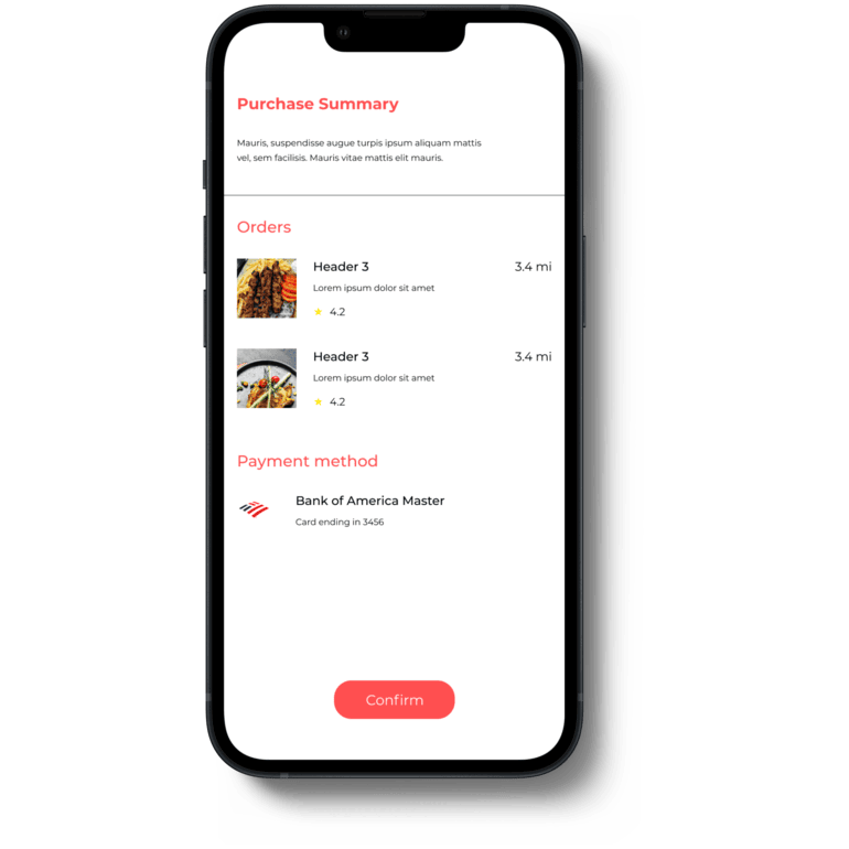
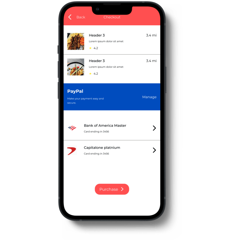
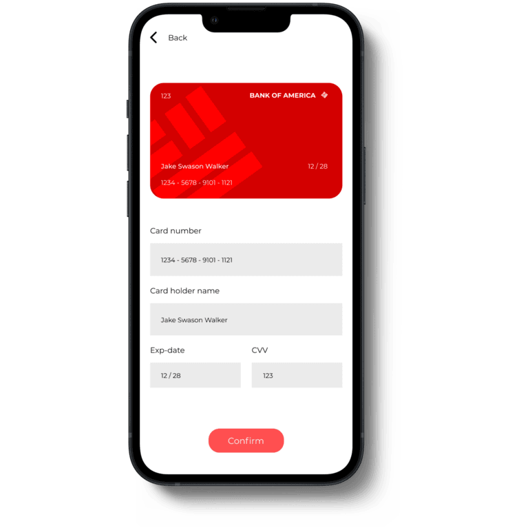
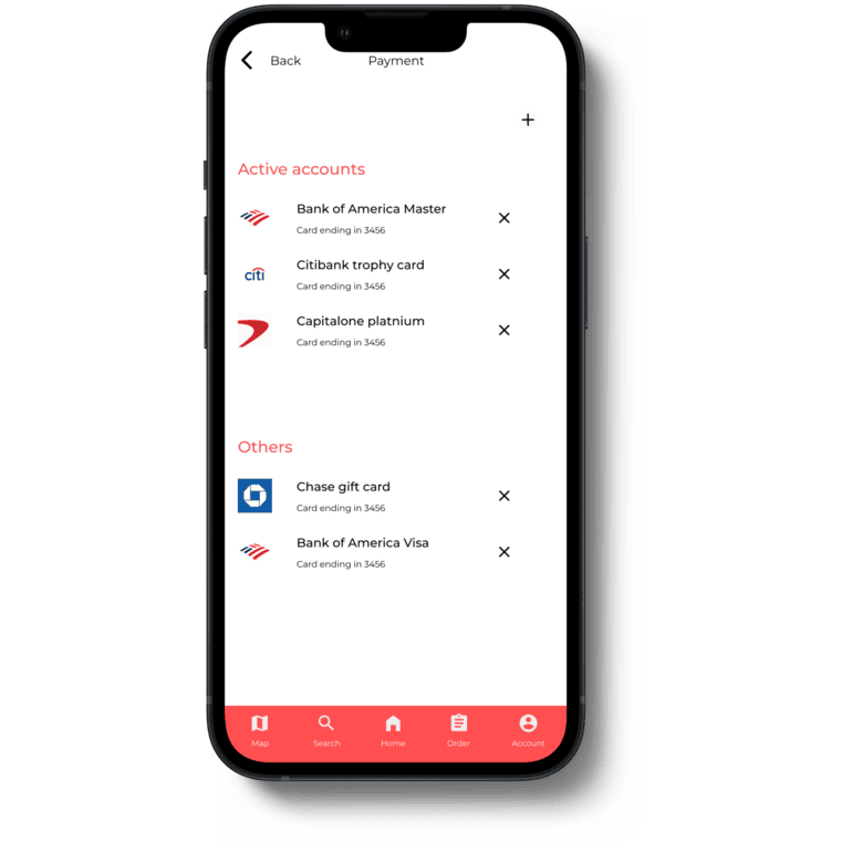
- So a efficient way to fix it is to have all the necessary things questions only and keep it in 1 to 2 steps.
- The best solution to that would be to integrate a way to ask users what they are feeling and using that to find possible matches.
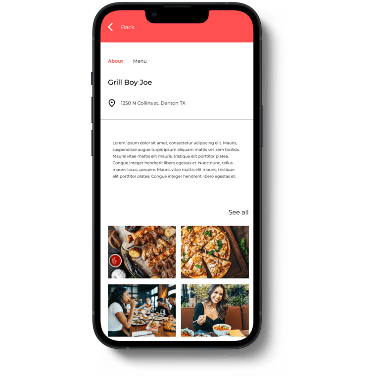
- I want to fix that by informing users about the food before making the order.