Product Overview
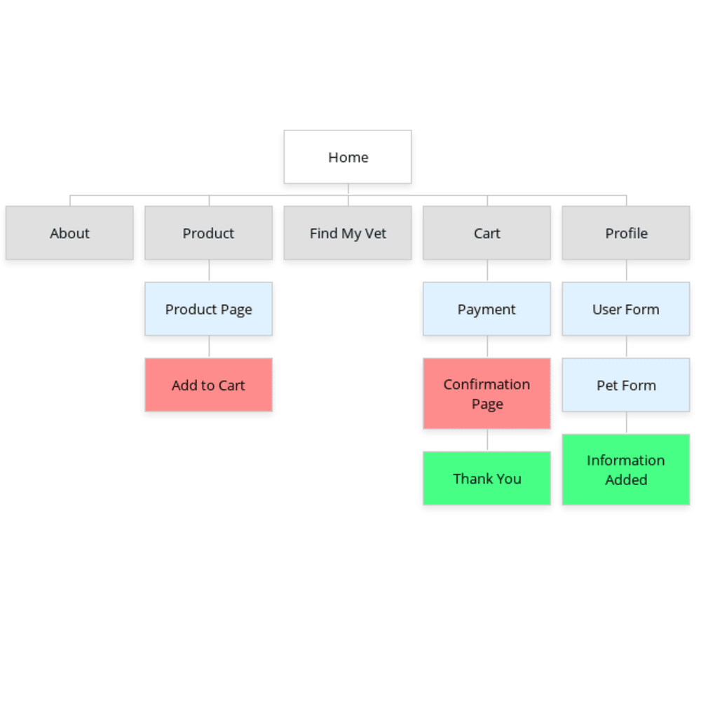
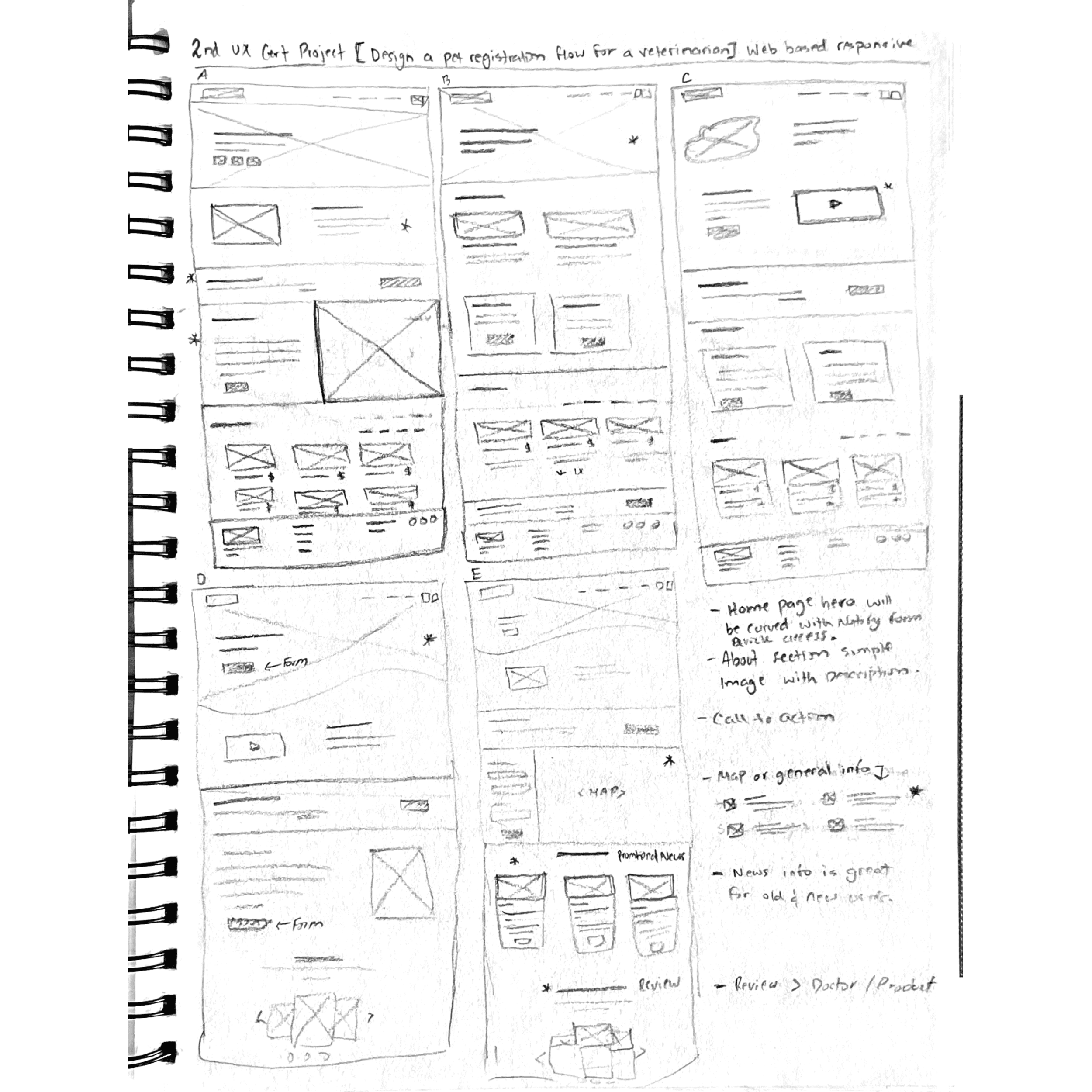
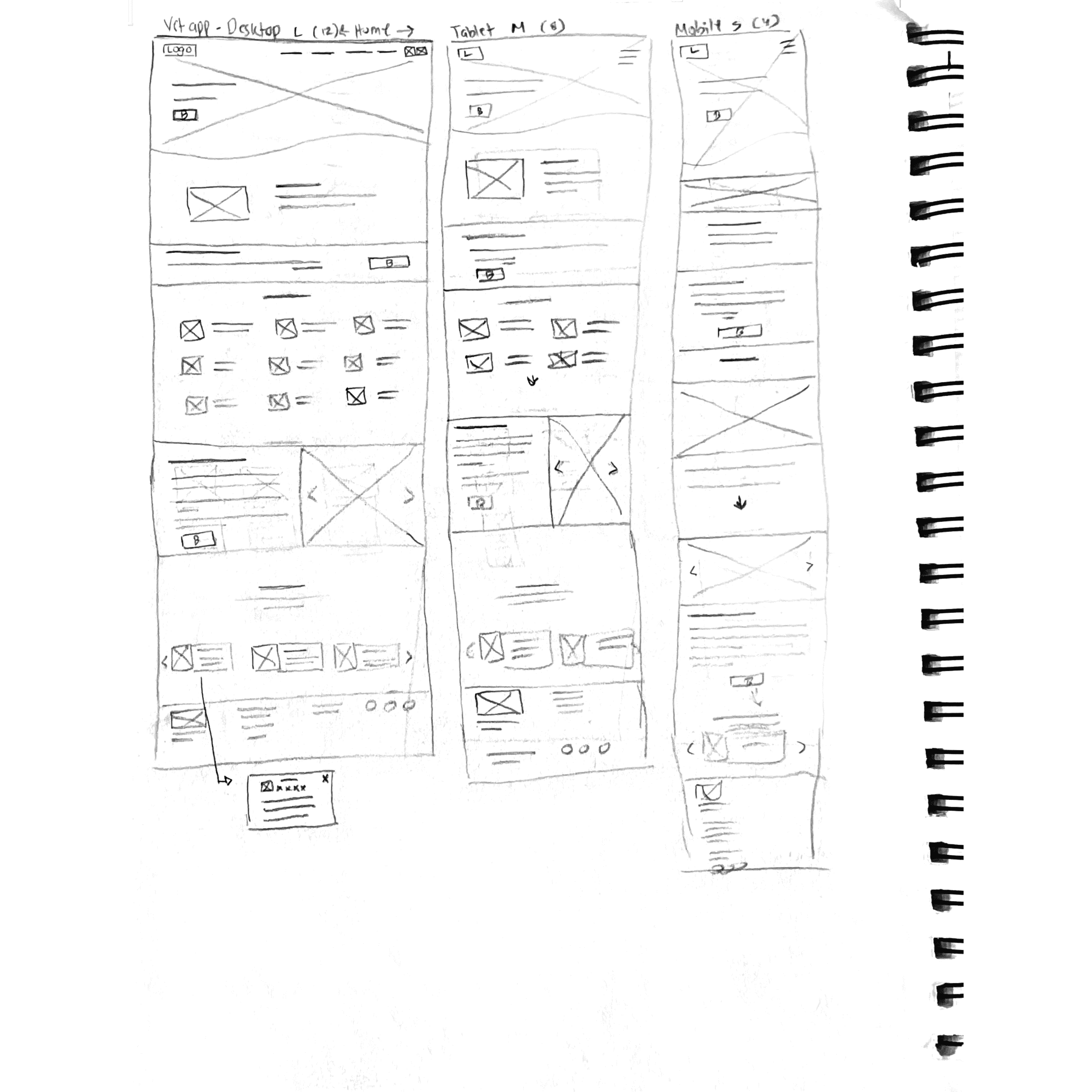
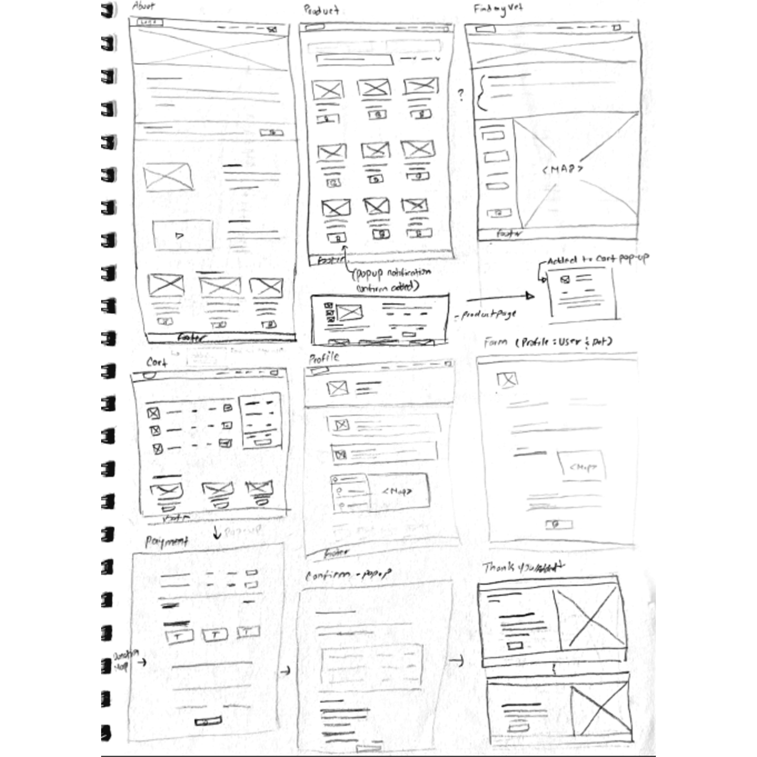
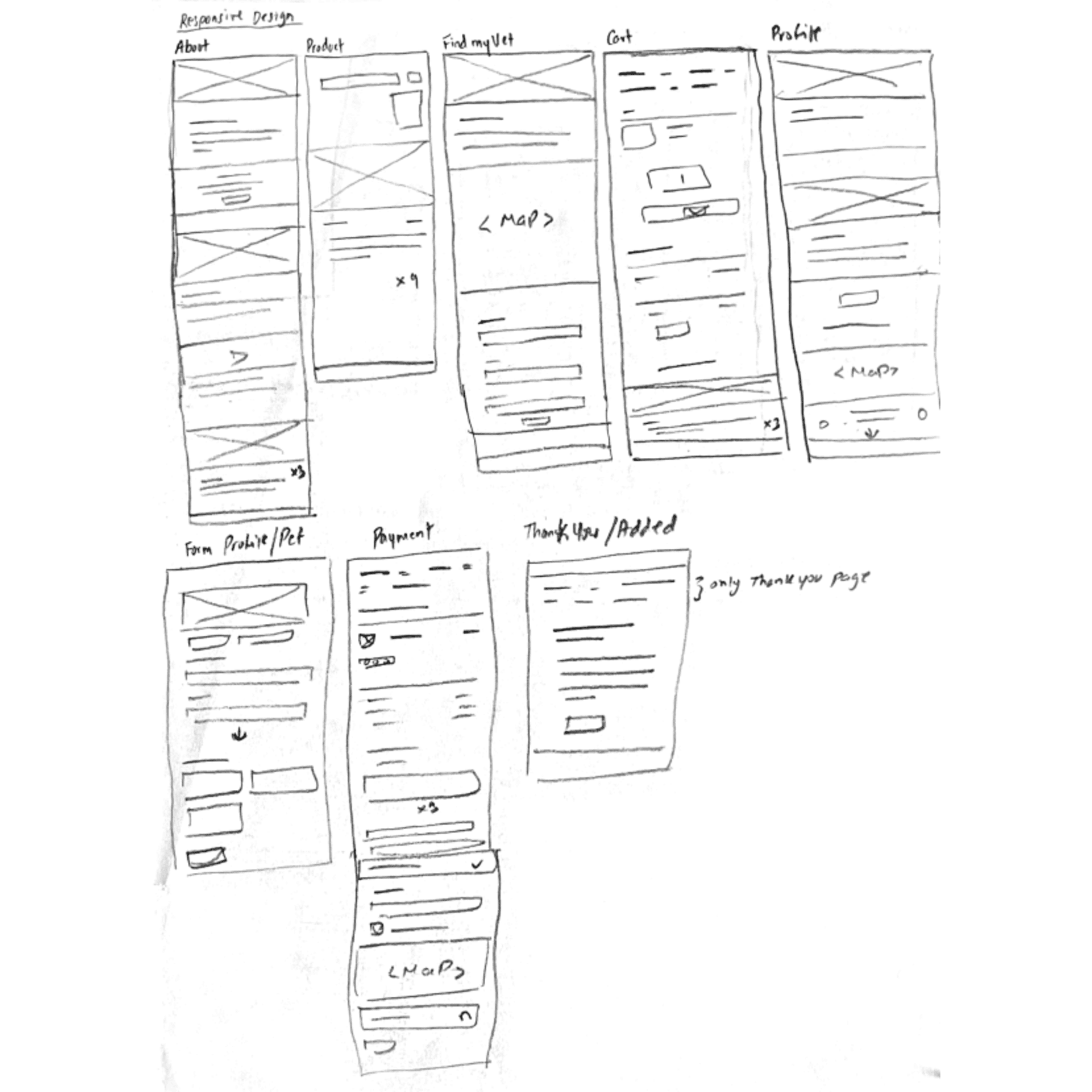
I designed a responsive pet veterinarian website to help pet owners find local vets, update pet records, and make quick purchases—all in one place for easier pet care management.
My Role: User Experience Research, Visual & Interaction Designer
Responsibilities: User Research, Usability Testing, Wireframing, Mockup and Prototyping
Softwares & Tools Adobe XD, Illustrator, Photoshop
Project Duration: November 2022 - January 2023
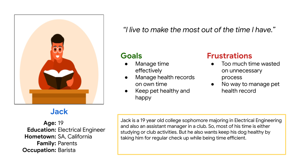
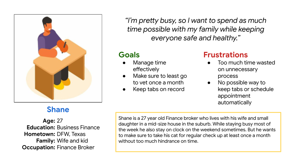
Painpoints and Challenges
- People find it hard to fill-up forms all the time.
- Finding trusting veterinarians can be a hard process.
- Finding pet product and medicine is hard and can be frustrating for users.
- Low confidence can hurt users and can deter them from visiting again.
Inital Solutions
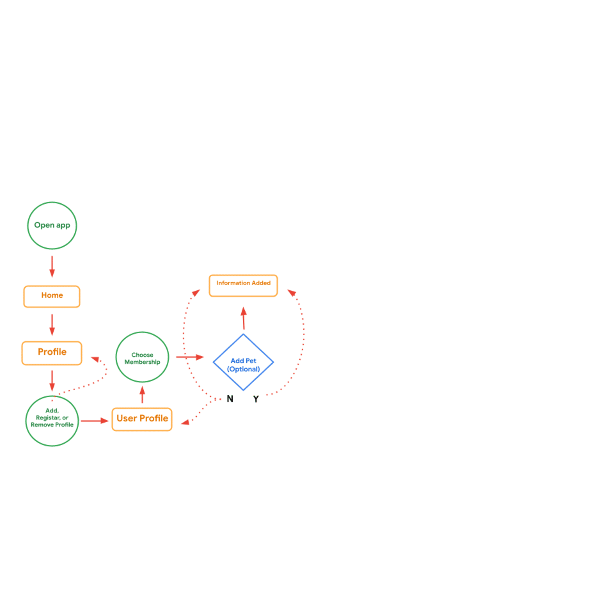
- So moving forward the design will implement pet profiles where users can enter or edit pet info or upload docs.
- Moving forward I want to design a way for users to find local vet practice around them that the site approves.
- When designing I want users to be able order/purchase whatever they need from the site in a easy checkout process.
- I want to build user confidence by letting the users complete their whole journey in one place hence building a one stop easy process.