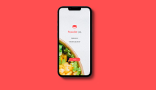
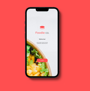
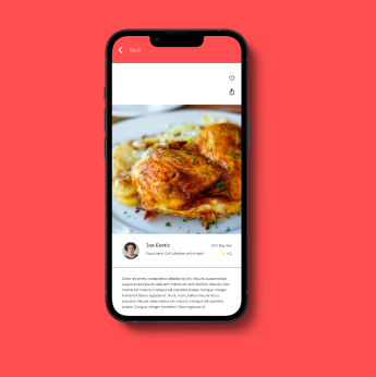
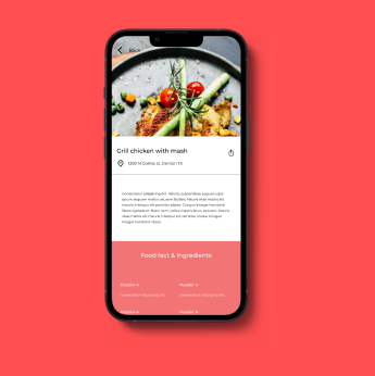
Product Overview

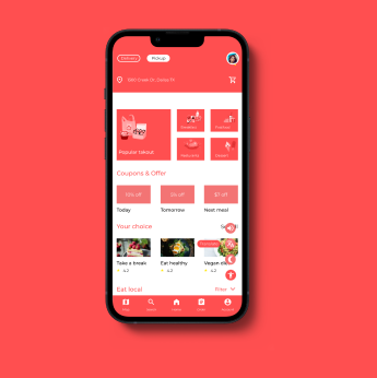
Designing a menu & payment mobile app for a restaurants to help users navigate and find food item fast, effectively and with quick checkout.

Project Duration

January 2022 - June 2022

My Role

User Experience research, Visual & Interaction designer

Responsibilities

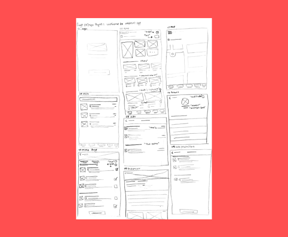
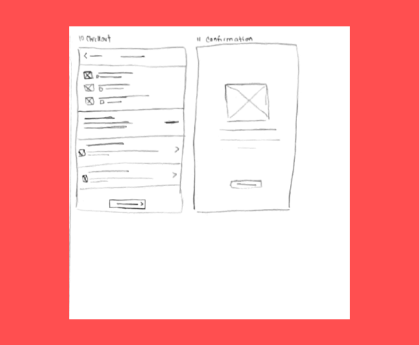
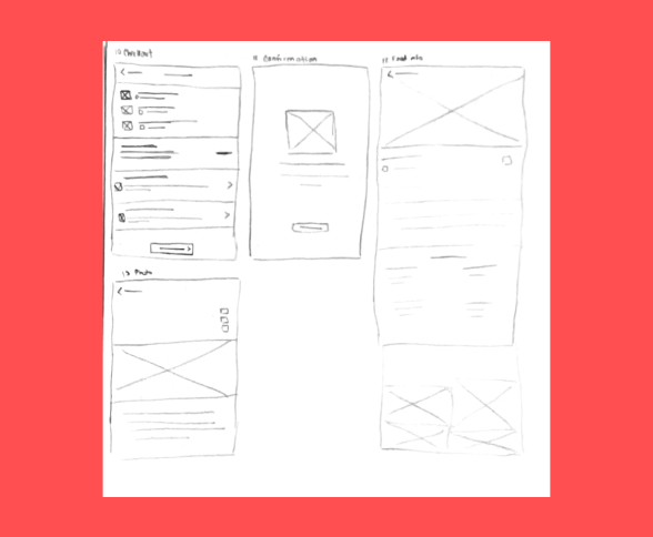
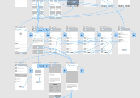
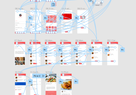
User research, Wireframing, Mockup and Prototyping

The Problem

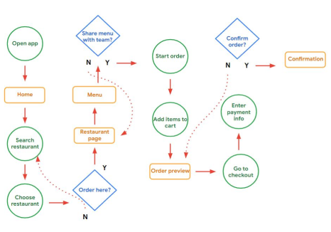
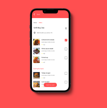
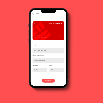
Users have trouble finding diversity of food items. As well as the checkout feature is very time consuming.

The Goal

The goal is to make sure that this app has features that let users choose and find a diverse selection of items. Plus, make the checkout process quick and smooth.
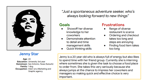
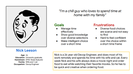
Target Audience

Participants can be people who make group orders once a week; it can be for social or work related reasons. Remote workers are also welcome.

audience

Painpoints and Challenges

  1. From the interviews many users have hard time finding diverse items.

  2. Users hate long checkouts especially when they are asked multiple questions.

  3. Many people get tired of eating the same food all the time.

  4. When users make orders they always have doubts.
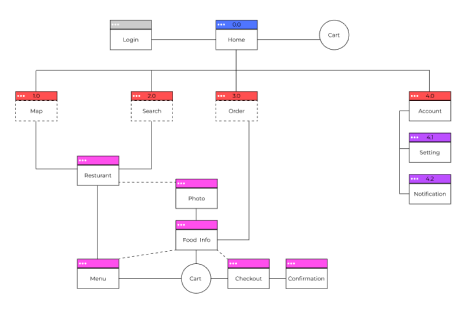
Solutions

  1. I believe that going forward the design need to integrate a theme selector to fix this pain point.

  2. So a efficient way to fix it is to have all the necessary things questions only and keep it in 1 to 2 steps.

  3. the best solution to that would be to integrate a way to ask users what they are feeling and using that to find possible matches.

  4. I want to fix that by informing users about the food before making the order.
Research Design User-Testing Final-Product

User Research Overview

Going into this research I first started by taking some quick surveys to pinpoint potential users. Afterwards I commenced with the interview and asked series of questions pertaining to their experience when using a food app, then I used those interviews and built two personas and their user journey. At first I was assuming that people are mostly focused on the checkout not being fast enough. But I learned that wasn’t the only issue, users had problem being confident in their choice as well as finding food items if they have any particular choice.

From there I created wireframes and did some usability testing in a unmoderated setting where I could observe the user interact with the app without any outside help. Making it more natural and helps with understanding the user thought pattern when interacting with the product. Afterwards I made adjustments to the design and created the mockup design and prototyped for final testing phases.

Persona & User Journey Map A

Persona A

Persona & User Journey Map B

Persona B

Information Architecture

Sitemap (IA)

App User-Flow

Userflow
lofi wireframe 1 lofi wireframe 2 lofi wireframe 3

Lofi-Wireframe

Lofi wireframe prototype

Unmoderated Usability Study

This project I utalized Unmoderated usability study to conduct research on my intial and final UI prototype. That way I was able to observe the user in a natural setting where he or she is able to interact with the product without having to rely on another.


By doing it this way I was able to get insights on how and where users meet challenges or complications in real.

Lofi wireframe prototype

Round 1 & 2 of Finding

  1. Users confused when asked to remove items from cart.

  2. More guidelines and options on Map.

  3. More visual elements to help improve usability.

Finding Solutions

  1. Added more visual cues.

  2. Incorporated more guidelines and feature to help users easily locate their nearest restaurant in the area.

  3. Used various icons and imagery to help improve usability.

Hifi-Wireframe

Lofi wireframe prototype

Accessibility Considerations

1

I made sure to include enough icons in my design so users understand what they are clicking.

2

I also made sure to use great color contrast for users with poor visibility to easily navigate and use.

3

Added some accessibility consideration I made sure to include in the design are dark mode, translations and text-reader functionality that will make using the app easier and memorable.

Impact

The app really makes the whole food ordering process easy and informative.


One quote from peer feedback:

“Simple design with elegant use of font and colors”.

Learning Outcome

I learned to really head deep into researching key users and analyze how they interact with my design. Using those analysis I was able to further improve my design and make it more user-friendly.

1

I would love to use my current prototype to do some more user testing and further improve the design.

2

Afterwards I would love to start developing the prototype into an actual usable app.

3

My final thing would be to collect user data on the app usage and learn about how users interact with the app.

Thank You

Thank you so much for reviewing my work for the Foodie app! If you like to to see
more or get in touch my contact info is down below.


Email: adisiddque6@gmail.com
Website: adilasami.com